SQUIRREL_13099559
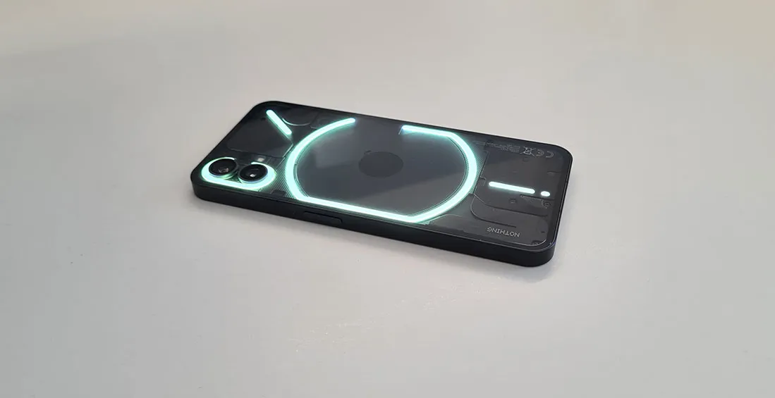
Like a peacock spreads its feathers to make itself more appealing, the new Nothing Phone (1) uses its plume of 900 LED lights arranged behind transparent glass to separate itself from the many identical-looking smartphones available these days.
But, as a feature that essentially amounts to a fun gimmick, Nothing’s light-up ‘Glyph’ notification system is by no means enough to make it more worth your time than the Samsung, Google and iPhones of the world.
Looking past the aesthetics, has this start-up tech company made a phone worthy of becoming your daily product, or is this all just a load of hype? We spent a few weeks using the phone to make up our minds.
Lights, camera, action
When it comes to the Nothing Phone, the first thing you’ll likely notice is the army of lights on the back. This is the Nothing Phone’s unique selling point, known as ‘Glyphs’.
These are intended as a notification system, flashing in different combinations and colours, with a variation of vibrations. However, for this to really be beneficial, you have to always have the device out, lying on its front.

As someone who naturally keeps their phone out on tables, lying face down, this was pretty convenient for me. However, if you keep your device in your pocket, or prefer it to be face up, you’ll have to do some reshaping of your habits to get the full use of this application.
While this is a fun feature and one that immediately makes the Nothing Phone stand out, it really isn’t as useful as it sounds. While you can select a number of different presets for the Glyphs, you can’t program them to change for different notifications. This means, for now at least, you never actually know what your notification signal is for.
This led me to turn the phone over every time the lights went on, essentially defeating the whole point of it. In the end, it became more of a distraction than an assist. However, Nothing has suggested plans to update this in future with the ability to alter the Glyphs to different notifications.
Apple of your eye
Squint your eyes, and if it wasn’t for the firework show on the back, the Nothing Phone would start to really resemble an iPhone. Between the squared-off design and the camera bumps on the back, this looks a lot like if Apple decided to create an Android device.
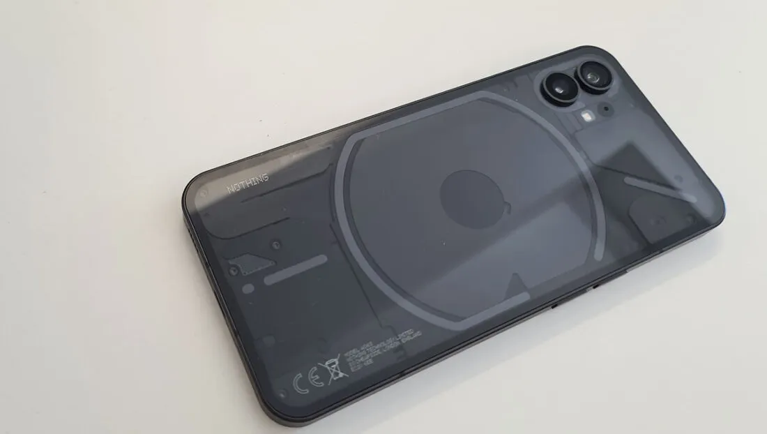
However, it’s the back of the device that sets it apart from the crowd. To show off the glyph system, Nothing has made use of a transparent glass back.

Along with the notification lights, you can also see some bolts, screws and sensors. Obviously, this isn’t actually what’s inside the phone, but it’s a cool visual effect that you don’t see very often.
Specs and features
So the phone looks nice, and it even has a unique, if somewhat gimmicky feature not seen on other devices… but is that all there is to see? In a way, yes.
The Nothing Phone is very much a standard smartphone in every other category, offering mid-line specs for a solid price, but that’s by no means a bad thing.
The 4500mAh battery will easily get you through a full day of casual usage, and the Snapdragon 778G+ processor keeps up with most activities, even getting you through some more intensive games, and easily tackling most daily tasks.
Where the Nothing Phone really performs is through its display. It features a 6.55-inch Full HD+ OLED display. This will mean your content will appear bright and crisp, no matter what you are using the phone for.
On top of that, the phone boasts an impressive 120Hz refresh rate. This affects how many times the display fully refreshes each second, the higher the number, the smoother the scrolls, transitions and general movement around the phone will feel.
Most phones at this price point will cap you at 60Hz, or top out at 90. This is very much one of those features that sounds unimportant... until you've tried a higher refresh rate.
Camera quality
The Nothing Phone’s camera is essentially what you would expect at this price point: nothing special, but also well-equipped for the average photography situation.
Unlike a lot of smartphones these days, it is very simple. There are two lenses on the back: one wide and one ultrawide, both of which are 50MP. Between these two, you can range from a 0.6 zoom ultrawide shot, though to 2x zoom at the maximum.
While you won’t be able to zoom in on far away objects, for the most part, your shots will look pretty great, especially in well-lit situations in sunny weather or a room with bright lights.
However, situations with lower light aren’t quite as impressive. Night photography is certainly a weak point for the phone, and darker scenes can come out with a bit of blur, or a meek colour balance.
Verdict
There are a lot of smartphones revealed every single year, and most of them look nearly identical. The Nothing Phone (1) deserves some praise for trying something different.
However, the Glyphs, the transparent design and small unique features here and there are not what makes the phone worth buying. Instead, the Nothing Phone’s value lies in its ability to offer a solid smartphone at a good price tag… with a bright neon bow strapped to the back of it.
It’s important to remember though, that this is Nothing’s first smartphone, and only its second product overall. While that is exciting and allows the brand to get creative with this device, there is some concern to be had.
When you attach 900 LEDs to the back of a smartphone, there is the possibility for things to degrade over time. Like all new adventures in tech, these factors are worth keeping in the back of your mind.
SQUIRREL_13099559
Alternatives
iPhone SE

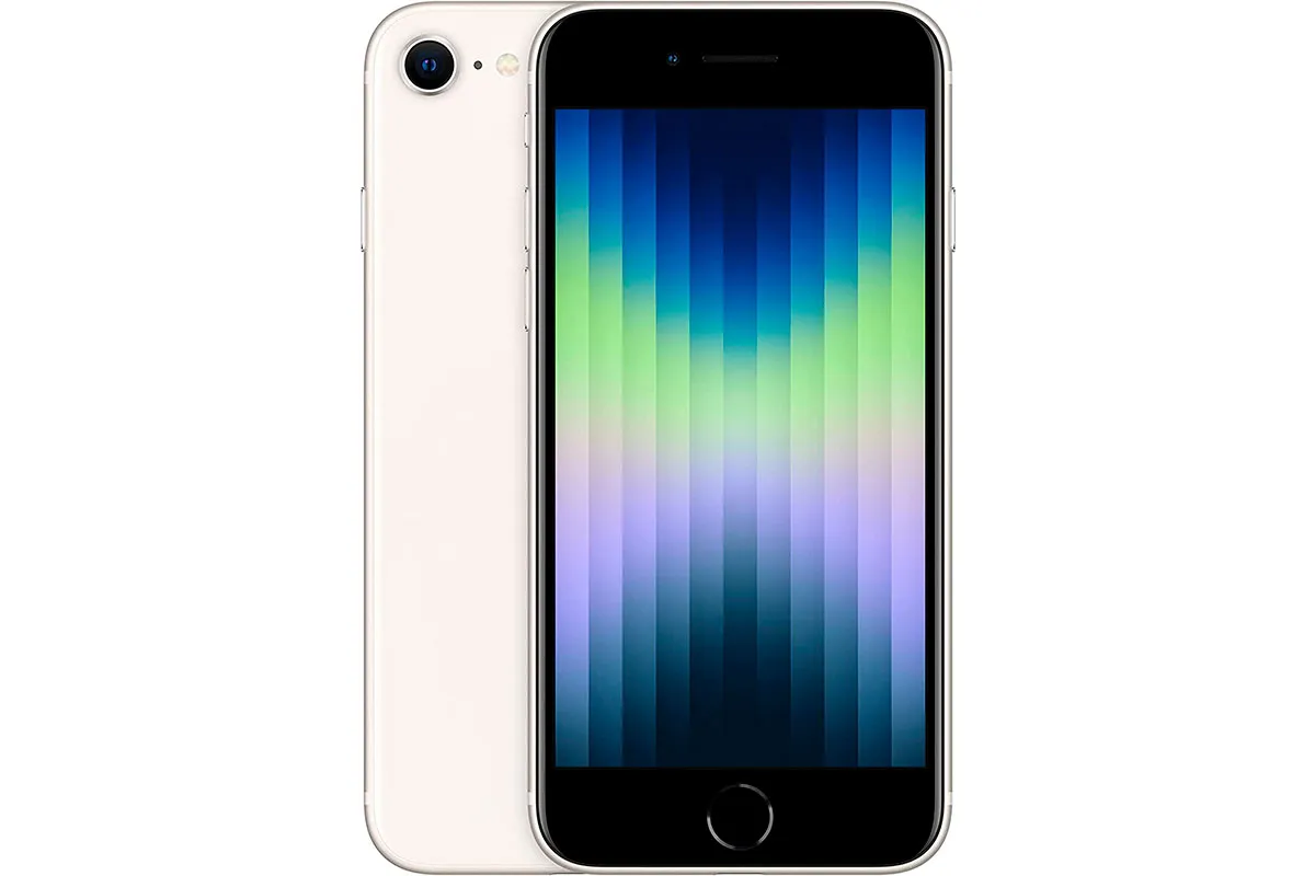
The Nothing Phone (1) takes some clear inspiration from Apple, so going for the brand itself is an obvious alternative. While most of the iPhones available are much pricier, the iPhone SE falls into a similar price range.
It features one of the best processors available in smartphones right now, and while you are limited to just one lens, the camera uses some smart software to produce shots that will put the Nothing to shame.
SQUIRREL_TEXT_13067241
Google Pixel 6a

When it comes to Android devices, the Google Pixel 6a is about the closest thing you'll get to the Nothing Phone (1). A simple sleek design, a clean user interface, and a pretty great camera system for the price.
Of course, the design isn't quite as exciting as Nothing's glowing back, but the Google Pixel 6a is by no means a boring looking device.
OnePlus Nord 2

OnePlus excels at smartphones in this price range, managing to cram a lot of high-end specs into an affordable price tag. While this is by no means as interesting in terms of looks or features, the OnePlus Nord 2 offers a compelling alternative in absolutely every other category.
SQUIRREL_TEXT_13075364
Read more:


